→UP & FIRST TO MARKET.
Inspired by lightness and the effortless playful rise of a balloon.
First is a B2B startup reimagining how companies connect through cold outreach. In a crowded space filled with automation and noise, First offers something rare: clarity, colour, and confidence. We partnered to create an identity that speaks clearly and acts quickly, just like the messages it’s built to send.
The Challenge
In a crowded space of automation and templates, F1RST needed to feel human. Empathetic. Memorable. The brand had to move differently, both in how it looked, and how it spoke.
Our Approach
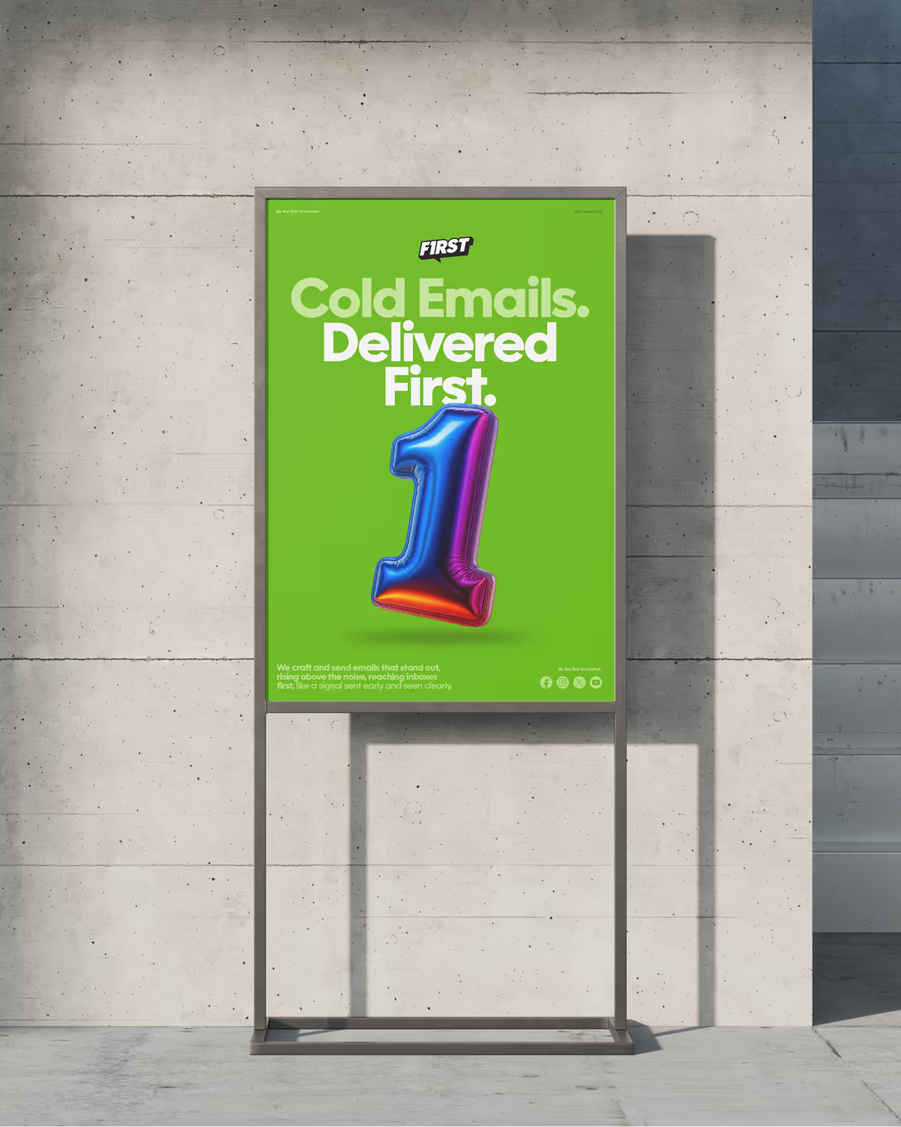
We built the brand around a single idea: Up & First.
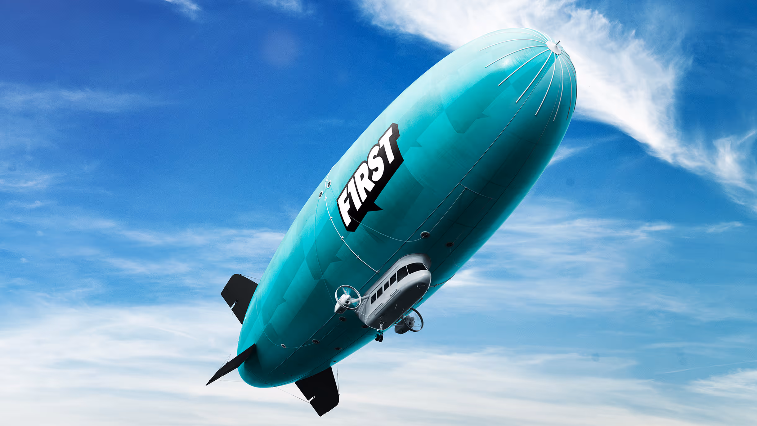
The balloon became our metaphor. A symbol of lightness, movement, and elevation. From there, we shaped a system designed to rise both visually and verbally.
The Solution
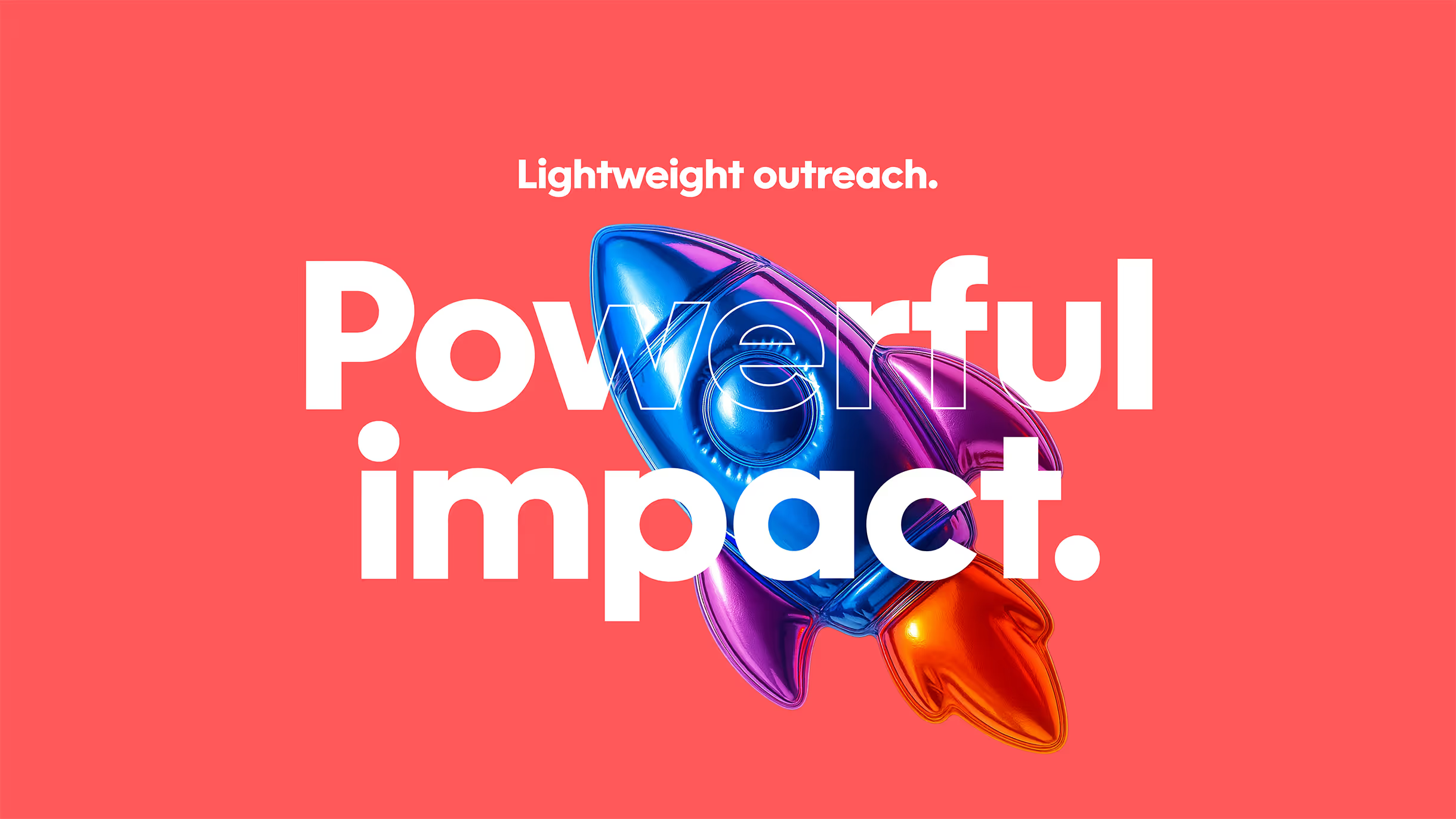
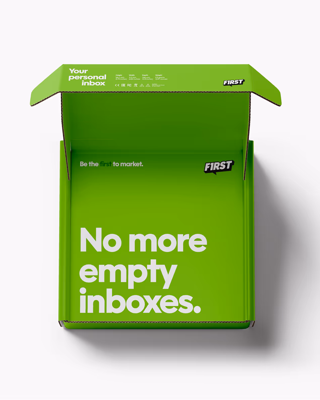
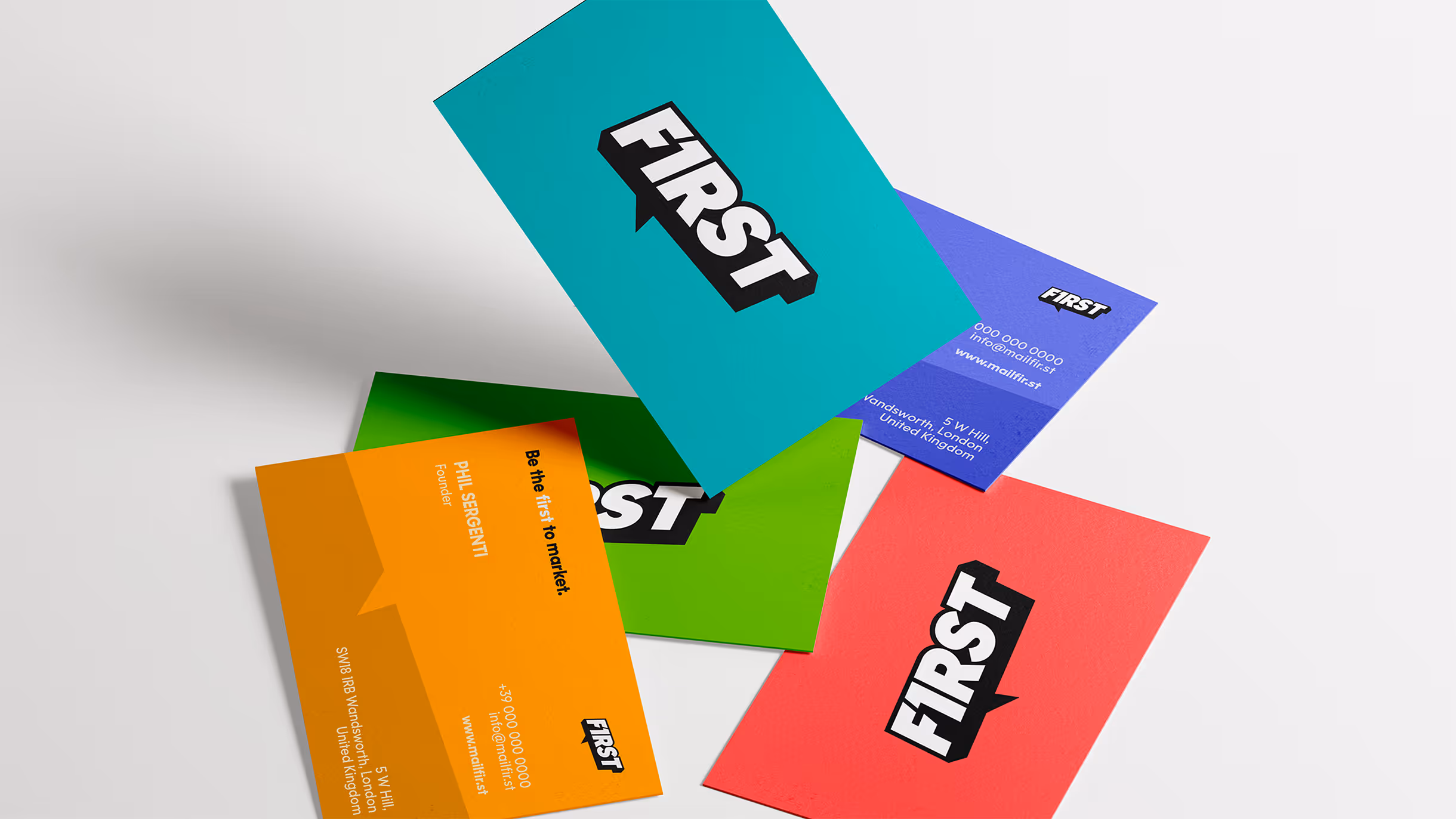
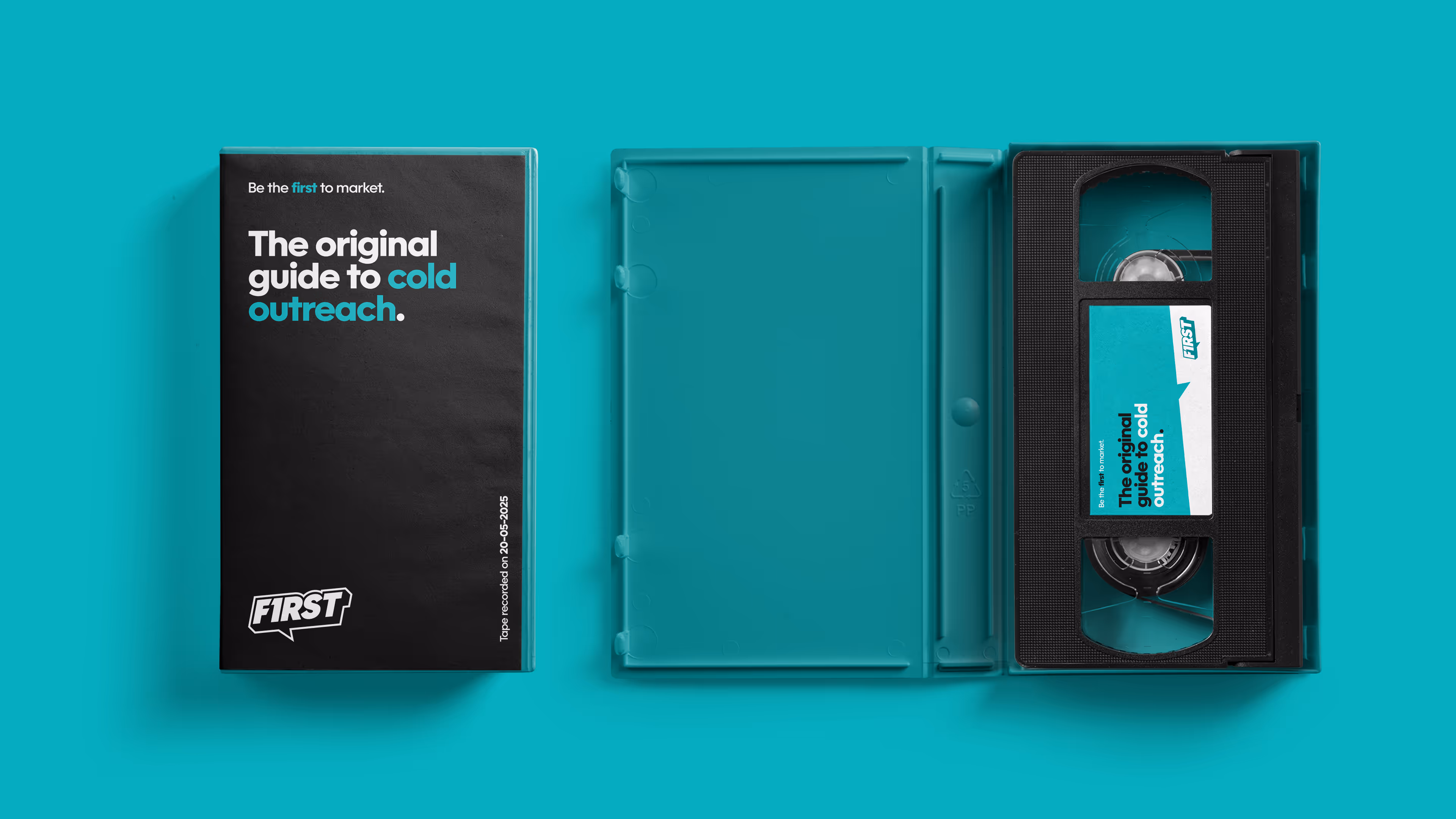
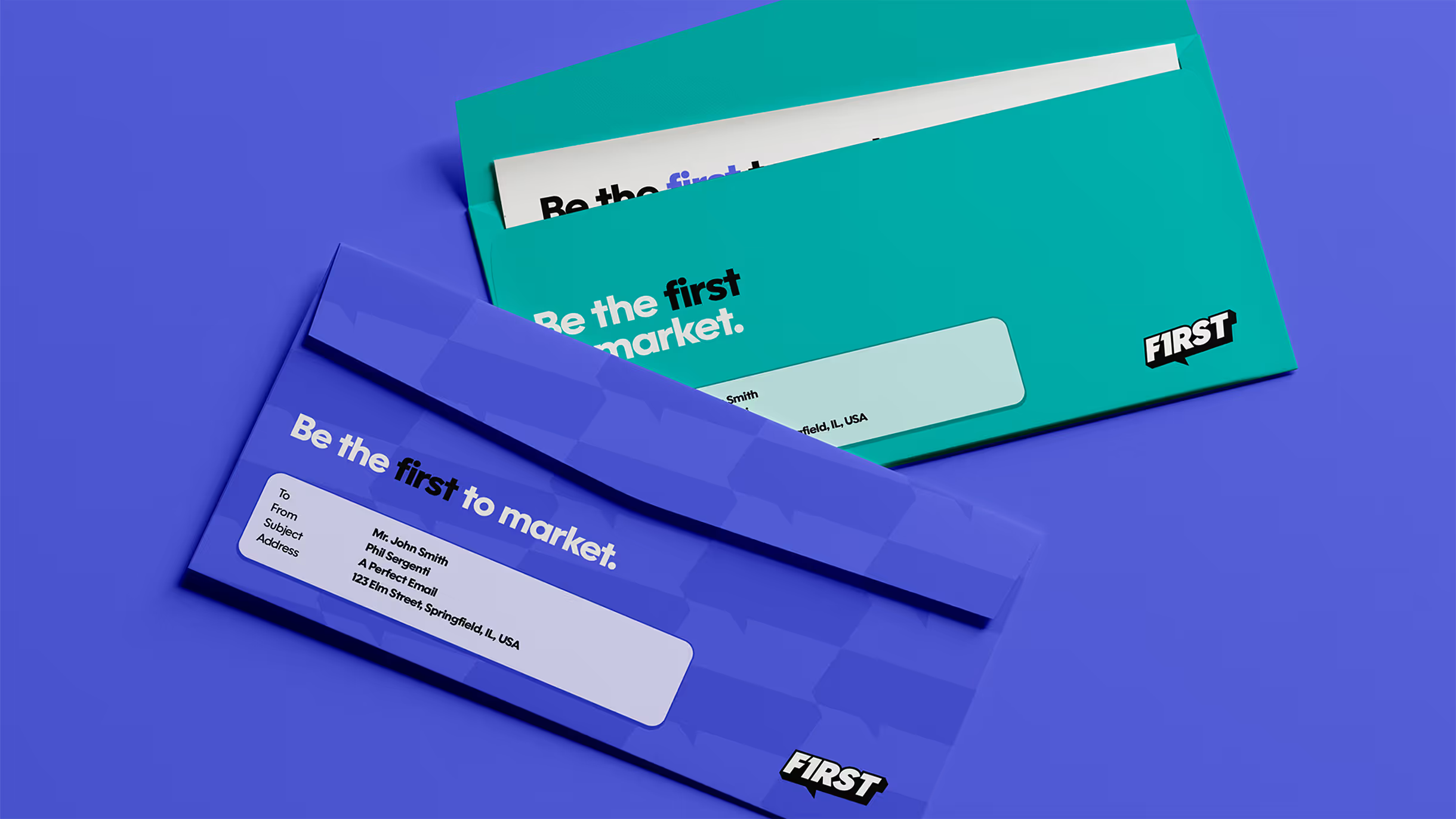
We created a brand system built on lightness, clarity, and momentum. A bold 3D logotype that floats. Soft, elevated, and full of energy. It’s not just a logo. It’s a symbol of motion.
The identity is supported by:
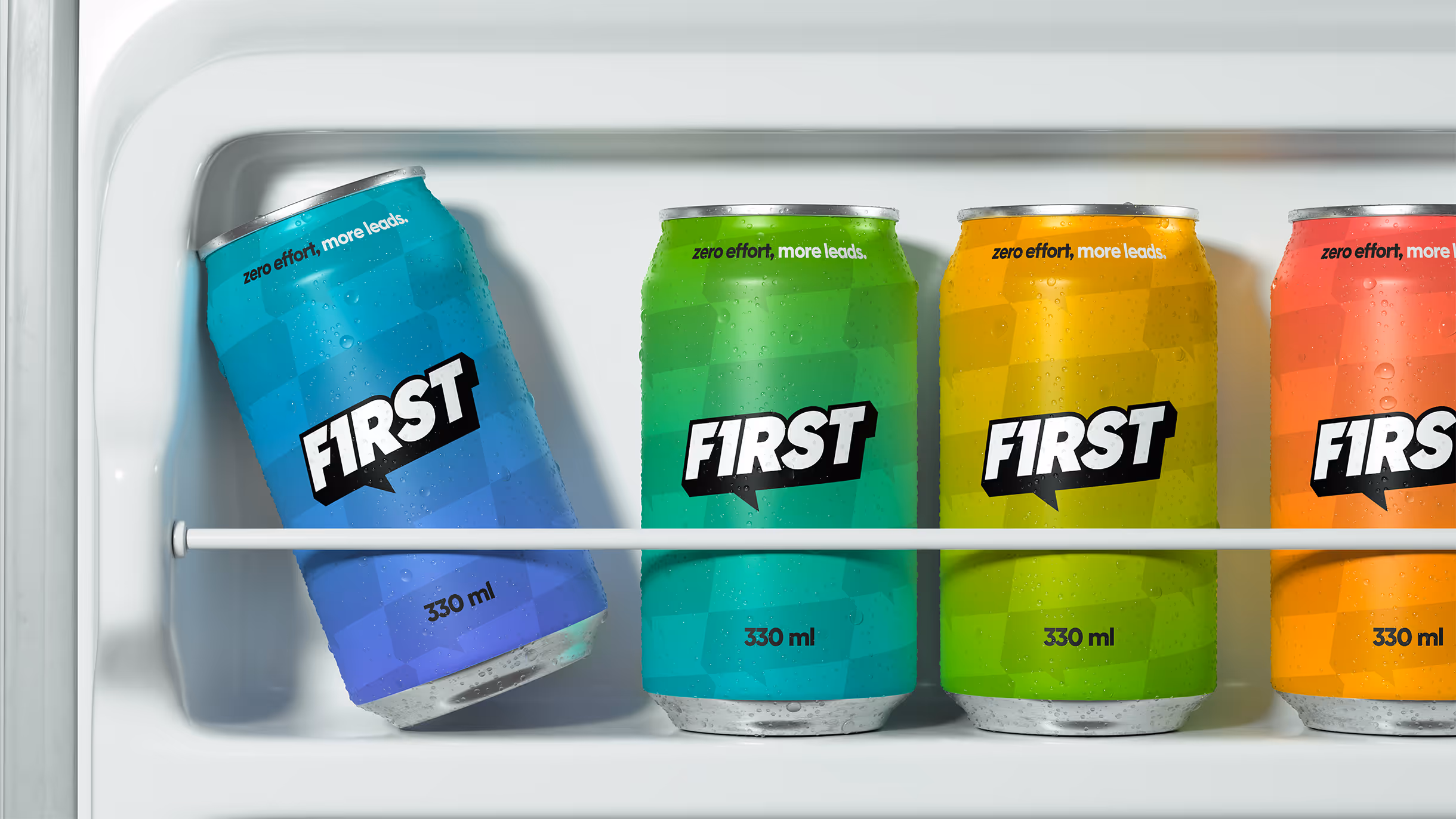
A vibrant color palette of colours and gradients that cuts through corporate grey.
A visual language designed to move, rise, and reach out first.
A tone of voice that connects with simplicity and precision.
Everything works together to express one clear idea: This brand doesn’t push. It lifts. It floats. It leads.
The Outcome
First launched with a clear voice, a distinctive motion identity, and a system that lifts every message it delivers. A brand that leads by being effortlessy light, direct, and unmistakably first.
Be the first to connect. Be the first to rise. Be the first to market.
Logo Design
Visual Identity
Graphic Design
MARCO GABANELLI
NICOLA PEZZOTTI
MARCO GABANELLI
NICOLA PEZZOTTI
LIANA BONANNO